Wednesday, March 28, 2018

Customize lightning:combobox (picklist) component using only CSS

The code below will create a dropdown list of selectable options. This code is taken from the Lightning documentation:
https://developer.salesforce.com/docs/atlas.en-us.lightning.meta/lightning/aura_compref_lightning_combobox.htm

<aura:application extends="force:slds">
    <aura:attribute name="statusOptions" type="List" default="[]"/>

    <aura:handler name="init" value="{! this }" action="{! c.loadOptions }"/>

    <div class="slds-size--1-of-4 slds-p-around--large">

        <lightning:combobox aura:id="selectItem" name="status" label="Status"
                            placeholder="Choose Status"
                            value="new"
                            onchange="{!c.handleOptionSelected}"
                            options="{!v.statusOptions}"/>

    </div>

</aura:application>
({
    loadOptions: function (component, event, helper) {
        var options = [
            {value: "new", label: "New"},
            {value: "in-progress", label: "In Progress"},
            {value: "finished", label: "Finished"}
        ];
        component.set("v.statusOptions", options);
    },

    handleOptionSelected: function (component, event) {
        var selectedOptionValue = event.getParam("value");
        console.log(selectedOptionValue);
    }
})

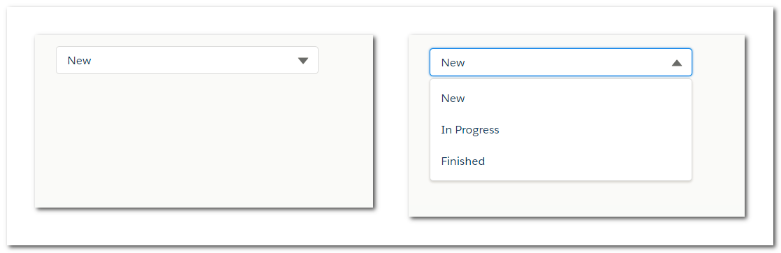
This is how it looks:

To hide the text label (Status), override this css class slds-form-element__label, and set display property as none. You can also set the variant attribute of this component as label-hidden.

As per the current implementation, this component doesn't support selection of multiple options. So there is no need of displaying the check-icon besides the option values. To hide this icon, override this css class slds-listbox__icon-selected and set display property as none. This is how the picklist looks now:

Now when the dropdown list is visible, we notice that the arrow icon is still pointing downwards. Let's manipulate this icon so that it points upwards in this scenario. For this, add a transform property to this element and rotate 180 degrees, like below:
.THIS .slds-dropdown-trigger.slds-is-open .slds-combobox__form-element .slds-icon {
    transform: rotate(180deg);
}

This is how it looks now:

Now let's change the background color of selectable options on hover.
.THIS .slds-dropdown-trigger.slds-is-open .slds-listbox__option.slds-has-focus {
    background-color: cyan;
}

This is how it looks now:

Notice the blue border glow around the read-only inputbox. You can change this color to cyan like below:
.THIS .slds-input:focus, .THIS .slds-input:active {
    border-color: cyan;
    box-shadow: 0 0 3px cyan;
}

This is how the lightning:combobox looks now, quite a simple one:

Finally, this is how the CSS style resource looks like:
.THIS .slds-form-element__label, .THIS .slds-listbox__icon-selected  {
    display: none;
}

.THIS .slds-dropdown-trigger.slds-is-open .slds-combobox__form-element .slds-icon {
    transform: rotate(180deg);
}

.THIS .slds-dropdown-trigger.slds-is-open .slds-listbox__option.slds-has-focus {
    background-color: cyan;
}

.THIS .slds-input:focus, .THIS .slds-input:active {
    border-color: cyan;
    box-shadow: 0 0 3px cyan;
}


Share This:    Facebook Twitter

Tuesday, February 13, 2018

Salesforce Lightning: What browser am I using? What version is my browser?


You can use $Browser global value provider to return information about the hardware and operating system of the browser accessing the application as described in the link below:
https://developer.salesforce.com/docs/atlas.en-us.lightning.meta/lightning/expr_browser_value_provider.htm

But it cannot be used to detect the browser type or version number.

You can use the below code to detect the browser on which you are running your Lightning application. Here, I am checking whether I am on Internet Explorer or not:

checkBrowser: function (component) {

    var browserType = navigator.sayswho= (function(){
        var ua= navigator.userAgent, tem,
            M= ua.match(/(opera|chrome|safari|firefox|msie|trident(?=\/))\/?\s*(\d+)/i) || [];
        if(/trident/i.test(M[1])){
            tem=  /\brv[ :]+(\d+)/g.exec(ua) || [];
            return 'IE '+(tem[1] || '');
        }
        if(M[1]=== 'Chrome'){
            tem= ua.match(/\b(OPR|Edge)\/(\d+)/);
            if(tem!= null) return tem.slice(1).join(' ').replace('OPR', 'Opera');
        }
        M= M[2]? [M[1], M[2]]: [navigator.appName, navigator.appVersion, '-?'];
        if((tem= ua.match(/version\/(\d+)/i))!= null) M.splice(1, 1, tem[1]);
        return M.join(' ');
    })();
    if (browserType.startsWith("IE")) {
        component.set("v.isIE", true);
    }
}

If the value of isIE attribute is true, then you are running on Internet Explorer. Similarly you can check for Chrome, Firefox, Opera and other browsers.
Share This:    Facebook Twitter

Thursday, January 4, 2018

Lightning: Star rating component


This is a simple, highly customizable star rating component.

Attributes:
value: this is the actual value which represents the value of rating
readonly: when set to true, the rating cannot be edited.

To use this component:
<c:StarRating value="2" readonly="false"/>

Refer the github link for the code:
https://github.com/iamsonal/Star-Rating
Share This:    Facebook Twitter

Tuesday, December 19, 2017

LockerService


The LockerService architectural layer enhances security by isolating individual Lightning components in their own containers and enforcing coding best practices.
  • LockerService implicitly enables JavaScript ES5 strict mode.
  • A component can only traverse the DOM and access elements created by a component in the same namespace. You can’t use component.find("button1").getElement() to access the DOM element created by <lightning:button>.
  • LockerService applies restrictions to global references. LockerService provides secure versions of non-intrinsic objects, such as window. For example, the secure version of window is SecureWindow.
Salesforce have decoupled the Content Security Policy (CSP) from LockerService and have made it available as a critical security update.

References:
LockerService API Viewer app: http://documentation.auraframework.org/lockerApiTest/index.app?aura.mode=DEV
Share This:    Facebook Twitter

Total Pageviews

My Social Profiles

View Sonal's profile on LinkedIn

Tags

__proto__ $Browser Access Grants Accessor properties Admin Ajax AllowsCallouts Apex Apex Map Apex Sharing AssignmentRuleHeader AsyncApexJob Asynchronous Auth Provider AWS Callbacks Connected app constructor Cookie CPU Time CSP Trusted Sites CSS Custom settings CustomLabels Data properties Database.Batchable Database.BatchableContext Database.query Describe Result Destructuring Dynamic Apex Dynamic SOQL Einstein Analytics enqueueJob Enterprise Territory Management Enumeration escapeSingleQuotes featured Flows geolocation getGlobalDescribe getOrgDefaults() getPicklistValues getRecordTypeId() getRecordTypeInfosByName() getURLParameters Google Maps Governor Limits hasOwnProperty() Heap Heap Size IIFE Immediately Invoked Function Expression Interview questions isCustom() Javascript Javascript Array jsForce Lightning Lightning Components Lightning Events lightning-record-edit-form lightning:combobox lightning:icon lightning:input lightning:select LockerService Lookup LWC Manual Sharing Map Modal Module Pattern Named Credentials NodeJS OAuth Object.freeze() Object.keys() Object.preventExtensions() Object.seal() Organization Wide Defaults Override PDF Reader Performance performance.now() Permission Sets Picklist Platform events Popup Postman Primitive Types Profiles Promise propertyIsEnumerable() prototype Query Selectivity Queueable Record types Reference Types Regex Regular Expressions Relationships Rest API Rest Operator Revealing Module Pattern Role Hierarchy Salesforce Salesforce Security Schema.DescribeFieldResult Schema.DescribeSObjectResult Schema.PicklistEntry Schema.SObjectField Schema.SObjectType Security Service Components Shadow DOM Sharing Sharing Rules Singleton Slots SOAP API SOAP Web Services SOQL SOQL injection Spread Operator Star Rating stripInaccessible svg svgIcon Synchronous this Token Triggers uiObjectInfoApi Upload Files VSCode Web Services XHR
Scroll To Top